Monday, September 30, 2013

Vintage Dinosaur Art: The Age of Dinosaurs

Originally published in 1978, with this larger format edition appearing (under a different publisher) in 1987, The Age of Dinosaurs is filled with art that will be instantly recognisable to many readers in their 20s and 30s. The cover is the very epitome of the beautifully painted, but hideously outdated palaeoart of the '70s. This hugely fat apatosaur, with its elephantine wrinkliness, lizardy head and mountainous flesh heap body, screams "WRONG! WRONG! WRONG!" at modern audiences. Yet artist Bernard Robinson (for it was he) has made it possible to appreciate this work on artistic merit alone.


Robinson was especially adept at scaly skin textures, so it's a little strange that his apatosaur is so damn wrinkly. Nevertheless, he remains consistently good at lifelike shading and lovely landscapes. His work evokes what is, for many, a nostalgic vision of tail-dragging, cold-blooded behemoths. Of course, there's something a little strange going on in this picture, as an extremely perky Barosaurus is striding into the midground. Darren Naish has already provided an excellent commentary on this image, so over to him:
"It’s as if the Barosaurus is an inter-dimensional tourist, just in from a parallel '1960s Bakkerian' universe and now strangely juxtaposed against the flabby, massively over-weight swamp-dwelling behemoths of the Zallinger era (hey, great idea for a comic)."
You know, that really is a great idea for a comic - a 'when worlds collide' scenario where classic palaeoart reptilimountains meet the pumped up steroid-o-saurs of today. It's tempting to think that the old guys wouldn't last five minutes, but they'd certainly have a significant weight advantage. Maybe a Robinson-esque apatosaur could be deployed like a rolling log down a hillside, squishing countless little feathery theropods on the way down.


Speaking of which, Robinson was actually rather good at painting Archaeopteryx, too; not perfect (the feathers are occasionally attached to the wrong digits), but they at least look like not-quite-birds, rather than little lizard gits with scaly dragon faces and tiny 'extra fingers' (a trope I like to call 'Wings...but with hands!'). See the individual in the image above, and corresponding close-up below. Note that the contour feathers blend with one another convincingly, rather than sticking out all over the place and making a mess.


There are many more Robinson lovelies in TAoD, not least this painting of fighting pachycephalosaurs. I remember this one particularly vividly from my childhood, and I believe that's down to the unnervingly lifelike, disconcertingly staring face of the individual in the foreground. It's a remarkable piece, with the animal's nodule-encrusted visage threatening to have your eye out; a real case of dinosaurs being in your face. It's an alien, otherworldly creature made remarkably real. It's perhaps also worth noting that the pronounced musculature and generally quite svelte appearance of the animals is unusually progressive for '70s-era Robinson. And the sky's nice, too.


Equally fetching is this lovely painting of an Ichthyostega pair in their steaming, swampy home. Unfortunately, a great deal of it is covered up with a dirty great text box, in which author David Lambert claims that animals couldn't see any reason to live on dry land; they just reached the shore, shrugged their incipient shoulders, and sunk back into the bog. The lousy layabouts. You're doing nothing for vertebrate evolution, you squishy-skinned slackers!


While I remain a big fan (in spite of the occasional...unpleasantness), there's more to TAoD than just Bernard Robinson. John Francis and Ross Wardle are the other two illustrators, although individual pieces aren't credited (or signed, as with Robinson's), so unfortunately it's difficult to figure out who produced what. Almost as unfortunately, a lot of the illustrations also appeared in the earlier Dinosaur World, and I really did review that one too recently to start wheeling out repeats. Nevertheless, one tends to get a wider view of the reused illustrations in TAoD, so it's possible to see, for example, just what that hungry T. rex was chasing. Gangly, anachronistic hadrosaurs, as it turns out.


Hurrah. There's also enough new stuff to pad out this post, including the below Triceratops, depicted charging through dirt with a wonderful momentum and carefully applied flying mud splatters. When compared with other animals in this book, the Triceratops' anatomy is really rather good, with the artist making effective use of the unusual perspective. On the other hand, this does make it all the more cringe-inducing that the animal's 'eyebrow' horns are shown protruding from its frill. Gah...


As if to underline my point about the Triceratops actually being pretty decent (but shame about the face), it shares a double-page spread with this bizarre retro ankylosaur, complete with stunted tail, pangolin claws and grumpy turtle mug. Seemingly, relatively accurate ankylosaurs only entered popular books en masse in the late 1980s, and then it was because they were all copies of John Sibbick's Euoplocephalus from the Norman encyclopaedia. As with the freaky giraffoid Barosaurus, freaky woodlouse ankylosaurs were an artistic meme that long outlasted their sell-by date.


The book is topped off by a marvellous 'dinosaur parade', featuring some excellent watercolour work and amusingly shifty-looking dubious-o-saurs. Leonard Nimoy is wisely running away, of course, but it's not the disinterested Tyrannosaurus he needs to worry about - not when that Stegosaurus looks so utterly furious. While ol' plateback might be too slow to catch him now, it knows exactly where he lives, and will shuffle back there and hide in the bushes until the following morning, when Nimoy will find himself brutally thagomised on his doorstep. Stegosaurus is patient. Stegosaurus always wins.

Paul Heaston's Facebook comment is also worth mentioning here.
"Dinosaurs? In the Shire?"


And finally...does anyone know the origin of the Gangly Dork Parasaurolophus? We've already seen them once in this book, of course, but the below is particularly superb example of this rather baffling meme. For a long time, Parasaurolophus - even moreso than other hadrosaurs - was depicted as having a highly upright carriage, noodle neck and piffling feeble forelimbs for no good reason whatsoever. Presumably just another case of artists copying artists copying artists.


And that's your lot! Coming up soon...a review of All Your Yesterdays. Hopefully.

Wednesday, September 18, 2013

Vintage Dinosaur Art: Be a Dinosaur Detective

There's been so much Dougal Dixon on this blog in the last few years, I've actually petitioned David to rename the it to 'Love in the Time of Dougal'. He refused, but nevertheless, the rather prolific author surely featured significantly in the childhoods of many readers. Certainly he featured in Adam Smith's, the present-day plesiosaur and dinosaur biscuit expert, for the Dougal-authored Be a Dinosaur Detective is another book lent to me by him.


Of course, while it's important to take a moment to honour Dixie Doug (as his little known country-and-western alter ego* is named), we're really here for the artwork; it's Vintage Dinosaur Art, after all, not The Fantabulous 1980s World of Dougal Dixon (although that sounds like it has potential, you know). Steve Lings was on illustration duty for BaDD, although the cover looks like it might have been painted by a different artist. Bernard Robinson aficionados will note that the sauropod's body is copied from his painting of Apatosaurus (described by Darren Naish as "very rotund"), but the artist has improved upon it with a helter skelter neck and slightly amused facial expression. The children depicted in the bubble serve to represent the reader(s) for size comparison purposes inside the book, which is fortunate in that we never have to look that closely at their freakish faces again.


Brrrr.


Dating from 1987, many of the dinosaurs in this book are quite 'modern' in appearance; this T. rex, for example, has huge (if slightly odd-looking) muscles and birdlike feet complete with tarsal scutes. The tail might be on the ground, but the posture's definitely leaning more towards the horizontal.


Other theropods fare similarly; Deinonychus, Dromiceiomimus (or is it Ornithomimus?) and Compsognathus, while conspicuously scaly (or is that warty?) by modern standards, are nevertheless depicted running at full pelt. Being tiny, the Compsognathus is being threatened with an enormous magnifying glass, presumably to reduce it to a charred husk that can be ground up and sold in buckets with a side order of fries and a Diet Coke, please. Lings' Baryonyx is low slung, but not quite a quadruped, as it was frequently depicted in the late '80s. He also manages to avoid falling into the trap of giving it a freakish hand, with one giant hook surrounded by a cluster of tiny vestigial digits, as others did back in the day.


By way of contrast with the theropods, the sauropod spread is decidedly retro, with a miserable bunch of bland-looking, tail-dragging schlubs. At least Opistho...Opisthocoeli...this one livens things up by rearing and adopting a face that's all, "Look ma! No hands!"


BaDD invents non-technical names for each key dinosaur group, the better that kids can remember them. This way, ankylosaurs become the 'welded dinosaurs' ('cos they're fused, see?), while ornithopods become the, er, 'two-footed plant-eaters'. The Iguanodon appears to take after a John Sibbick piece, but we all know what you're looking at, you dirty scoundrel. As if having a tacky gag stuck to its head wasn't enough, Tsintaosaurus just had to go and look so damn sad about it. It's like it's anticipating your reaction. Poor Tsintaosaurus; the resonating chambers are hypothetical, and there's no reason that they always have to be inflated in that way, and yet people keep on making it a literal dick head (see also: this toy).


Since I've been told off about this before, I feel obliged to point out that BaDD features a decent overview of dinosaurs' skeletal features and possible lifestyles, and - since the book is all about sleuthing - posits questions on why animals may have evolved certain features. Note the question on 'duck-bill' hands - the answer is quite revealing of how dinosaur books in the time had one foot in the pre-Dino Renaissance past:
"A duck-bill's paddle-like hands would have helped it to swim."
 Wouldn't it have helped to not have the hand be so narrow? Oh, whatever.


Lings is a good artist, but his approach to ceratopsians is a little odd, and may be informed by the work of John McLoughlin, who believed (as recently discussed) that the animals' frills would have been anchored to their backs by ludicrous amounts of muscle, rendering them spiny-shouldered neckless wonders. Hence the flat-headed Styracosaurus we see here, and a similar Triceratops elsewhere.


Of course, it's not all dinosaurs in BaDD - those pesky 'other' Mesozoic animals make their contractually-obliged appearances, too. The plesiosaurs are pretty good, all things considered, boasting retracted nostrils, eyes in the right sort of place (ish) and even vertical tail fins. This might also be the cheeriest Kronosaurus ever committed to paper. Why, he's even encouraging kids to have a go at making their own plesiosaur out of plasticine and string. However, the book doesn't mention that you will also require a palaeontologist on hand to give you a slap on the wrist whenever you start snaking the neck around. There's no arguing with biomechanics.


Pterosaurs pop up too, with the obligatory Burianesque Pteranodon joined by an alarmingly purple Quetzalcoatlus. We're out of Pin Headed Nightmare Monster territory by this time, but the azdharchid still looks a little strange, what with its stick-thin arms and capsule-shaped body.

There's also the fact that the Pteranodon are apparently clinging to a sheer rock face upside-down, but that's cool. Careful analysis of highly compressed JPEG photographs of Pteranodon fossils has revealed that they possessed gecko-like pads on their hands and feet. It's not mentioned in Mark Witton's book 'cos he doesn't know nothing about pterosaurs, that guy.


As is par for the course in a 1980s book, Archaeopteryx is featured alongside the pterosaurs as a 'Mesozoic flying animal', although it is nevertheless noted that birds are thought to have evolved from dinosaurs. This is a classic 'wings...but with hands!' rendition of the animal, although you've got to love that colour scheme. Wild.


It's quiz time! Yes, there is a little irony in including an '80s-tastic Spinosaurus in a lineup like this, given that a great deal of its anatomy has, indeed, been completely made up (albeit by scientists making educated guesses, rather than Ray Harryhausen - see below). The ineffectual four-fingered hands and grinning 'carnosaur' fizzog are just fantastic. It seems to be waving hello. I wouldn't be taken in.


And finally...the two imposters in the quiz. On the left we have a gliding ankylosaur with theropod hands, a concept so gloriously silly that Hasbro even made a 'genetic mutation' toy out of it (oh yes they did). On the right we have the titular creature from The Beast from 20,000 Fathoms, which is a beautiful thing to crowbar into a 1980s children's dinosaur book. His characteristically cheerful expression makes me wonder if someone's made a toy out of him - preferably, a plush toy. If not, someone needs to work on it, post haste. Go on, Internet, don't let me down.

*This is a complete lie.

Monday, September 16, 2013

Citipati in Quarks & Co. television spot

A few readers are perhaps already familiar with this Citipati illustration which I did about two years ago. It has even been featured on this blog once before.


Back in January this year, I was contacted by a writer from the German television broadcaster, WDR, requesting permission to use this illustration for their science documentary strand, Quarks & Co. The programme in question, I was informed, concerns a certain Jack Horner's proposal to create a 'chicken dinosaur', to which I think no LITC reader requires any explanation.

I wasn't sure whether or not the use was going ahead and soon forgot about it altogether. It transpired that it did indeed take place and that the programme itself had actually aired in late February and early March. The short animated sequence in which the illustration appeared can be seen here.

Thankfully the image still reads well even though it has been flipped for the purpose. They also referred to it as an Oviraptor, rather than Citipati -- but oh, well. The pleasantest surprise is that they even constructed a skeleton to match.


As a side note, I would of course have given it feathered fingers and a much thicker tail base were I drawing this now, and would also have resolutely avoided the running posture.

This was a post of not inconsiderable substance for me. Oh, my! Unfortunately, my next one will be a return to my usual vacuous form. I am so sorry.

N

Thursday, September 12, 2013

EXCLUSIVE: Jurassic Park 5 poster leaked

With the recent reveal that the fourth Jurassic Park movie will be titled Jurassic World, the hype machine is ramping up in hot anticipation of the 2015 blockbuster. But we at LITC have been leaked another huge bit of news about the Jurassic Park franchise: this is a new trilogy. Directors have been lined up, scripts are d-o-n-e done, and work on the marketing has even begun. Here's the exclusive leaked poster for the follow up to Jurassic World: Jurassic Holler.

Jurassic Holler

Hoo boy! Looks like we're in for some good ol' fashioned homespun finger-lickin' chicken-fried dinosaur-on-hillbilly action! The confidential Hollywood informant who contacted me has not yet revealed the title of the final film in the new trilogy, but I'm hoping for Jurassic Avenue, if only for the possibility of a dinosaur dance montage to this hot jam, with slightly altered lyrics.

Wednesday, September 11, 2013

I really love your tyrant feet

Back at the start of the month, the distastefully talented author, artist, blogger, and nomen oblitum enthusiast Matt Martyniuk posed an interesting question on his Dino Goss blog - namely, does anyone actually have any evidence that non-avian dinosaurs possessed birdlike scutes on their feet? Well, it turns out that, in the form of Concavenator, they do, although that does limit said scutes to tetanuran theropods, and artists frequently depict animals far more distantly related to birds (even ornithischians) with them. As Matt pondered,
"I'm not sure when this meme began, and if it's related to the Dinosaur Renaissance when the link between birds and dinosaurs was re-established...Of course, like many paleo-memes that developed during the 1980s, the main idea seems to be using this as a flourish to make otherwise scaly dinosaurs seem more bird-like."
Those who know me - even those who regularly read this blog - might be aware that I have a 'thing' for theropod feet, particularly those belonging to Manospondylus gigas. With that in mind, I thought it might be interesting, given Matt's musings, to take a look at sexy rexy feet through the decades.

One other thing - I've also decided to turn this into a (very easy) COMPETITION! Hurrah! The first person to leave a comment naming all of the artists will get a rubbish dinosaur book from my out-of-control stockpile. I'll also throw in a card featuring artwork by Niroot, which I will ask him very nicely to sign.


Right, then. For starters, here's the Real Deal - sort of. These belong to a cast of 'Stan' mounted in the Oxford University Museum of Natural History, and they're really quite enormous. Check out the arctometatarsalian condition, whereby the middle metatarsal is 'pinched' between the other two.


Here's an early entry by a highly respected palaeoartist of the classic era. No sign of tarsal scutes here, but check out the rather large, apparently reversed first toe (hallux), jutting out like a spur.


This artist (signature censored, because I'm in denial) has illustrated T. rex with rather more slender, shapely toes and what appear to be weight-bearing plantar pads, in spite of also giving it a bizarre, splayed stance. The left foot in particular appears very birdlike, and the hallux is rather more stumpy.


On the other hand, this artist - working at around the same time, ish - has made the feet considerably chunkier, with soft tissue spreading much wider than the width of the bones and, by extension, the claws. No scutes here - just rounded, non-overlapping scales, like a lizard - although the artist has thought to highlight tendons.


This artist was well known for his excellently observed lizardlike scaly skin textures. The soft tissues on this tyrannosaur's feet are far more snug to the bone, with hardly any sign of fleshy pads to cushion the animal's weight.


Entering the 1970s, and there are still no scutes to be seen on this oddly rectangular-footed individual.


Finally, in the early 1970s, with the Dinosaur Renaissance underway, tarsal scutes appear on the tyrant's feet. Note also that this individual appears to be very energetic indeed - going for a jog, in fact, in stark contrast to its palaeoart predecessors.


While scutes may have started to become de rigueur back in the mid-'70s, it didn't necessarily always mean that the rest of the restoration was particularly birdlike. This model, for example, is highly crocodilian, with all manner of armour scutes covering the body - just check out that tail. The tarsal scutes, therefore, may well be unintentionally birdlike.


The same can't be said for this work; not only has clear attention been paid to the arrangement of the scutes, the general soft tissue profile of the feet (complete with skin stretching between the toes) has clearly been modelled on modern birds (see these, for example). One can obviously see appropriately huge plantar pads taking the strain and spreading as the animal walks forward; there are echoes of illustration #3, but the ankle is far slimmer.


By the time the '80s rolled around, one might have expected that all the big names would had adopted the birdlike style of illustration #8 - however, this wasn't the case. Of course, much about this illustration - from the incongruously wide stance, to the rather shapeless 'tree trunk' legs - has a distinctly retro air. However, the differences in approach are still striking; there is a complete lack of birdlike scutes and plantar pads, and the ankle joint is far less obvious.


And finally, to bring us bang up to date...a fine pair that should look quite familiar. Thoroughly modern, and yet  perhaps closer in appearance to illustration #2 than illustration #8 (without the strange stance, of course).

So there you have it - my worrisome theropod foot fetish laid bare. Is this my barrel-scrapingest post yet? Not by half (have you seen some of the desperate rubbish I've come out with before?). Remember, if you can name all the artists, there's a book in it for you. Get cracking! Oh, and don't forget to buy a copy of Matt Martyniuk's superb Field Guide to Mesozoic Birds and other Winged Dinosaurs, if you haven't already - it's worth it for the beautiful artwork, with an uncommonly realistic portrayal of feathered dinosaurs, alone.

Tuesday, September 10, 2013

'Triceratops isn't going anywhere'

I did have a legitimate inspiration for this latest piece of silliness.


I have a distinct recollection of the 'Triceratops didn't exist' issue re-surfacing very recently, chiefly on Twitter, but now that I try to go back to look for it in order to lessen the vacuity of this post, I am unable to find any mention of the thing. Perhaps I dreamt it after all. The drawing did seem to have been happily met with when I shared it, however.

That matter aside, perhaps it is entertaining enough to be left to the viewer's own interpretation, regardless of context. It also happens to fit in with the series of spleen-venting saurians I began a little while back, or Dinosaurs Attack: Classy Edition, as Marc has it. So there we are.

N


Wednesday, September 4, 2013

Vintage Dinosaur Art: Let me tell you about...Dinosaurs

Dinosaur books aimed at children haven't changed much over the last few decades, even as dinosaur science has gained a terrifying, unstoppable momentum, like a Dalek rolling down a mountain. Let me tell you about...Dinosaurs is from 1983 (with this edition arriving in 1985), but you'll find its haphazard mix of slightly iffy anatomy and flagrant copying in a great many books that occupy a small niche in kids' bookshops around the world today. What's more, many such modern books are completely bloody uncredited, and so is LmtyaD. It's especially annoying as it would appear that a number of illustrators worked on LmtyaD, and some were, shall we say, rather more accomplished than the others.


The illustrations on the cover, for example, are actually pretty good from a purely artistic perspective; the shading and texturing, in particular, are rather impressive. Of course, the animals themselves are pretty bizarre - just check out zombie-hands Droopy the T. rex, and the Triceratops with legs that don't seem to have any muscles...or joints. The Apatosaurus, meanwhile, is the typical hump-backed Discount Value Pack Sauropod. It's a decent indicator of what's to come.


I'm rather fond of the work of one particular artist in LmtyaD; Niroot, too, has expressed a liking, and you definitely should listen to him, 'cos he's a professional artist and everything. The artist - let's chauvinistically presume they're male and name them Jambo van de Apenheul - makes excellent use of a deceptively diverse earthy colour palette and achieves some quite lovely, subtle patterning and texturing. Of course, he also draws Barney-like tyrannosaurs with tiny heads, which are a little distracting, but one can't help but feel that van de Apenheul could have made a very decent dinosaur artist, if only he'd had the right guidance.


Van de Apenheul is clearly also behind this illustration of Melanorosaurus, here mislabelled as Melanosaurus (which was actually a lizard, or so says Wikipedia - and who am I to question Wikipedia?). The slightly later Fabrosaurus, another one of those genera based on teeth that palaeontologists just love to spend all of their spare time sorting out, is shown to demonstrate how greatly even early dinosaurs could contrast in size. Unlike Melanorosaurus, poor Fabrosaurus is even dwarfed by its own name. The basal sauropodomorph is considerably less chunky and advanced-looking when shown in art these days, but hey, at least it's out there on the land. Quite unlike...


....this unfortunate brachiosaur, who seems to have wandered out to sea by accident. That's what having a tiny brain will do for you.


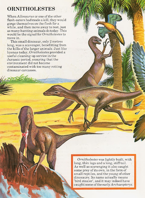
Back on the beach, and this depiction of Ornitholestes illustrates the pitfalls of combining copies of different artists' versions of the same animal. The animal in the background appears to be based on Giovanni Caselli's bird-nabber (itself a riff on Charles R Knight's original), while the individual in the middleground is based on Bernard Robinson's work. Consequently, they look like different species, with the Caselli-like creature sporting (more accurately) a smaller head and a reduced 'thumb' on its hand, while the Robinson-esque animal has more obvious lizardly 'lips' and a rather derisory expression on its face.


About halfway through the book, the artwork takes something of a turn for the worse - certainly in terms of depicting believable-looking creatures. Although T. rex isn't described as the bumbling silent movie comedian of some early '80s books, the artwork doesn't do the 'King of the Tyrant Lizards' too many favours; the above image could be a poster for Attack of the Killer Granny Smiths from Outer Space. Still, perspective is tricky when you have limited access to 3D references, and at least its head is the right sort of shape, and doesn't resemble a rubbery Halloween mask.


Oh boy. Hey, is anyone else reminded of one of those full-body dinosaur costumes, in which the wearer's polyester-wrapped legs are distractingly visible? Well, if the toothy front end isn't being waggled in your face, of course.


In a similar vein...ah, I love retro ankylosaurs, and this Euoplocephalus (formerly known as Ankylosaurus...wait, what!?) is simply a magnificent example; a sceptical-looking armadillo with barely-there legs and a tail terminating in an oven mitt. Meanwhile, Palaeoscincus (i.e. Edmontonia) is particularly cross, having lost the majority of its tail - which I'm quite sure has absolutely nothing to do with the fact that the tail was hidden behind another animal in Caselli's illustration.


Just as bizarre is this tottering Compsognathus, which resembles the bastard offspring of a hen and Dale Russell's 'Dinosauroid' (the tail was shortened during adolescence, you see) - rather fitting, given that a hen is mentioned in the text. The style is somewhat Caselli-esque here, too, with the thoroughly disgruntled face resembling that on Caselli's Compsognathus "corallestris". Thankfully, the flipper hands were left in the '70s, where they belong.


And finally...the anonymous author is having no truck with your reprehensibly unscientific questions. Every fossil find, from a 75% complete skeleton of Spinosaurus with preserved gut contents and eggs containing dainty spinosaur embryos, down to a tiny ammonite that's fallen from a Dorset cliff into someone's ice cream cone, is exciting to somebody.

Pffft. Cop-out. Bernard Robinson-esque Allosaurus is not impressed.

Many thanks to Adam S Smith for letting me borrow this book, a childhood favourite of his (although he nevertheless brought the disparity in illustration quality to my attention). Adam's a palaeontologist with a particular affinity for plesiosaurs and other marine reptiles. Check out his Plesiosaur Directory website and, of course, the Dinosaur Toy Blog.