
Published as part of the five-book Dinosaur Dynasty series back in 1993, Giants of the Earth was my childhood introduction to pop-palaeo stalwart Dougal Dixon. Each book in the series dealt with a different aspect of dinosaur science, with this one looking at, as the cover implies, their evolutionary history. The artwork is of a surprisingly high standard for the time, even if the obligatory early '90s Sibbick rip-offs are present and correct. The cover art, by Steve Kirk, is exemplary - a couple of very small tweaks, and it would pass muster even today. And the colour scheme is quite lovely. You can't go far wrong with stripy Styracosaurus horns.

The core of the book consists of a series of Mesozoic panoramas, packed to the tip-top of the tree fern canopy with period-appropriate fauna and flora. However, prior to that we are given a whizz through the evolution of lifeforms prior to the Mesozoic, in addition to a glorious Dinosaur Parade, featuring significant dinos-through-the-years in addition to a number of other, obviously lesser, animals. (Sorry, pterosaurs.)

The Parade is perhaps most notable for featuring the above Plateosaurus, which is astonishingly up-to-date for a children's book from 1993. I mean, not only is it a pure biped, but, by Bakker's beard, its hands are facing in the right direction (even if only by coincidence, given the theropods). Clearly, artist James G Robins knew his stuff; his style may be somewhat Paulian (in the best way), but he avoids some of Paul's pitfalls. It's enough to make Heinrich Mallison weep with joy. If only he could.

Here's another look at Robins' lovely parade, because why not? (What do you mean, 'copyright law?') The Tyrannosaurus proved memorable to me as a kid, as it seemed so svelte, so lithe - even in the early '90s, children's books still seemed to be full of cumbersome tyrannofatties, although at least none of them looked exactly like the Jurassic Park T. rex, I suppose. Note also the inclusion of the classic 'straight legs good, bent legs baaad' lesson in the top right.

On to the panoramas proper. The first is a rather static collection of weirdo Late Triassic beasties, with some slightly scary-looking Coelophysis poking their snouts in the bottom right hand corner. It's a little uninspiring compositionally when compared with some of the others, but at least gives a decent idea of how dinosaurs constituted a relatively small part of a very strange fauna. It's always nice to see the gharial-like Rutiodon pop up in a book like this, but there's something rather off about that Placerias - it seems to have been crossed with a temporally displaced ceratopsian.

Hurtling forward to the Early Jurassic, and here we see a plesiosaur doing what early '90s plesiosaurs did best - hauling its fat arse out onto the shore for some reason. As a kid, I was always struck by the strangeness of the 'big megalosaur' in this scene - why so many (clawed) fingers? Why the man-in-suit posture? It remains a curious anachronism, but as an adult I can at least appreciate the artistic skill in depicting the glistening skin of the plesiosaur and unfortunate ichthyosaur. That said, you've got to feel sorry for Dimorphoderp. Sibbick Scelidosaurus is just happy to be there.

The Late Jurassic scene contains perhaps the highest concentration of Sibbickisms; it's clear that artist Chris Forsey had the Norman encyclopedia close at hand. All of the animals in this scene (including an Apatosaurus just out of scanner reach) are rather heavy on the concentric skin rings, while the odd postures and skulls of Sibbick's theropods have been replicated quite faithfully. An exception is the Ornitholestes, here rendered as a cute miniature version of Ceratosaurus. Plaudits are awarded, however, for the tricky Stegosaurus perspective. It's not one you see very often, and I'm sure that's for a very good reason.

Poor old Baryonyx - he was a superstar back in the late '80s to early '90s, but these days is lucky to appear as a footnote beneath an incredibly awesomebro illustration of that enigmatic heffalump Spinosaurus, or outsized close relation Suchomimus. Never mind, though - here he gets to glare suspiciously from among a group of patriotic Brit-o-saurs, including Hypsilophodon and Polacanthus. This always was one of my favourite scenes, and is notable not only for depicting a mountainous landscape, but also a pair of small herbivores not fleeing in hysterical terror from a nearby theropod of significant size.

The Polacanthus, meanwhile, is rather, well, Sibbick-esque. Nice perspective, mind.

The Hell Creekish scene suffers a little from an attempt to ram in as many species as possible, but at least, again, gives a decent impression of the diversity of the dinosaurs in this place and time (something that might be difficult with a more 'realistic' illustration). The Triceratops and Ankylosaurus suffer from what I can only imagine was a lack of three-dimensional references, but it's marvellous to see Thescelosaurus making an appearance.
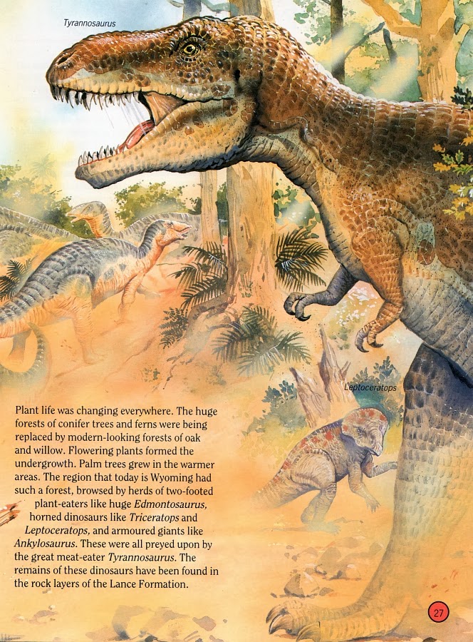
Of course, Tyrannosaurus gets to steal the limelight, crashing right into the foreground and roaring and splattering dribble all about the place. Happily, this illustration of Rexy appears to owe nothing to Sibbick's Normanpedia version, although that background Edmontosaurus looks suspicious. Elsewhere, Leptoceratops shouldn't be wandering around alone without competent adult supervision.
Overall, Giants of the Earth is distinctly better than average, and a book fondly remembered from my own childhood. Unfortunately, I never managed to acquire any of the other books in the series, something I plan on rectifying post-haste. To eBay!
The Styracosaurus on the cover is also a little reminiscent of the Battat figure. Which is rather lovely.
ReplyDeleteI have it too! So many memories....
ReplyDeleteI also remember this one! I used to get it from the library all the time when I was five or six (or seven or eight) even though I'd read it dozens of times. I'm pretty certain this was the first dinosaur book I read that wasn't decades out of date, and I remember it fondly; I think the dinosaur parade was my favourite part.
ReplyDeleteCheck out Abe Books too. I've found a lot of my old favorites there.
ReplyDeleteIt's weird seeing Dougal write about something that isn't a nightmarish future course of evolution.
ReplyDeleteI have this book too and really liked it. Does this version also include the many plates of individual dinosaurs? I remember thinking some of them were really good (the *Stygimoloch* and the *Avimimus* come to mind, as does the *Triceratops*) but thinking that the dinosaurs on the plates you've scanned here indeed were off, for the most part. I never believed in that weird *Ceratosaurus* or in the parade's *Quetzalcoatlus*, I can assure you!
ReplyDeleteNo plates of individual animals, and no Quetzalcoatlus in the parade either, I'm afraid. You might be thinking of another book in the series.
DeleteThis is the book he's talking about, includes all of the above and a lot more: http://www.amazon.co.uk/Dougal-Dixons-Dinosaurs-Dixon/dp/1563977222/ref=sr_1_10?s=books&ie=UTF8&qid=1384459230&sr=1-10&keywords=dougal+dixon+dinosaurs
ReplyDelete"The cover art, by Steve Kirk, is exemplary - a couple of very small tweaks, and it would pass muster even today."
ReplyDelete"Clearly, artist James G Robins knew his stuff; his style may be somewhat Paulian (in the best way), but he avoids some of Paul's pitfalls"
If you really like their paleoart (as do I), then I recommend Lessem's "Dinosaur Worlds" ( http://www.amazon.com/Dinosaur-Worlds-Don-Lessem/dp/1563975971/ref=la_B001IXRUBK_1_23?s=books&ie=UTF8&qid=1384470061&sr=1-23 ). There's both a lot of good paleoart by Steve Kirk & Jim Robins (E.g. Chapter 1's panorama: http://blogs.egu.eu/palaeoblog/files/2013/04/triassic-dinosaurs_1256_600x450.jpg ) & a lot of not-so-good paleoart by James Field & John James (E.g. The very derpy Giganotosaurus on the cover). In other worlds, there's a lot to admire & to make fun of, perfect for a LITC review. ;)
"That said, you've got to feel sorry for Dimorphoderp."
I was almost expecting a "Ha cha cha cha cha" caption, given that schnoz ( http://www.youtube.com/watch?v=QdYQvMYWP5k ).
"The Polacanthus, meanwhile, is rather, well, Sibbick-esque."
As is the Hypsilophodon in the foreground.
-Hadiaz
Just nabbed that one on eBay. Thanks for the tip! And yes, the Hypsilophodon is Sibbickian...or Sibbick-esque...or whatever I normally say, too. It's just missing the frond falling from the mouth.
DeleteLove the lumbering plesiosaur facing off Megalosaurus. Inspired by the Little Golden Book's Tyrannosaur fighting an elasmosaur? It's interesting to see some Illustrations becoming quite adventurous, like Polacanthus feeding in the shallows. I've wondered about amphibious ankylosaurs. After all, someone has at one time or the other tried to aquatify other dinosaurs.
ReplyDeleteLove this post….great collection and amazing images.Vintage posters are truely inspiring. You really do have your artwork and craft mastered. I like the feel of the poster. I think having a vintage feel is really part of its charm.
ReplyDelete