Friday, November 30, 2012

I Wrote a Song About Triceratops

Ceratopsidae
Ceratopsidae family crest by yours truly; it could be yours, truly.

I'd like to invite you all over to my tumblog, The Gallant Cannibal, to feast on a song I wrote several years ago as an ode to that iconic three-horned juggernaut, Triceratops. It's short and sweet. I tell the whole story of its creation over there, so I won't repeat it here. Suffice to say: if you like Triceratops, this is definitely a song about Triceratops.

Wednesday, November 28, 2012

Archosaurs of Alabama

Welcome back, everybody! Where last we left off, I'd done a brief, illustrated survey of some notable Alabama Cretaceous marine fauna. Here, we turn out attention to some of the archosaurs that would have lived in the parts of the state not covered in seawater. 

I speak, of course, of dinosaurs. Mostly. 


Nodosaurid  © Asher Elbein
Alabama has quite decent nodosaur remains, most of them the product of carcasses washed out to sea by floods and river currents. There, the bodies bloated and were extensively scavenged before they sank to the bottom. This is my first ever attempt at an armored dinosaur (or at least, the first I'm willing to show in public) and I initially thought of restoring it with bright warning coloration, similar to that of a hornet or a yellow jacket. Suffice to say, it didn't really work, so I defaulted to a more hippo-like pattern instead.

 I'm somewhat taken with the idea of nodosaurs dozing in mudpits, small feathered dinosaurs perching on their spikes. It might be worth illustrating at some point.

Lophorhothon © Asher Elbein
Lophorhothon is Alabama's main hadrosaurid, and like the nodosaur remains it occurs primarily in marine deposits. It has the twin dignities of being both Alabama's first recorded dinosaur genus and being one of its most taxonomically uncertain; there's some debate as to where, precisely, it fits with regards to other hadrosaurs (or if it's even a hadrosaur at all.) Following the prevailing opinion, I went ahead and restored it as something similar to Prosaurolophus. I wanted something restrained and somewhat dignified, so I turned to a color scheme reminiscent of African grazing mammals.

Dromaeosaurid  © Asher Elbein
The most speculative reconstruction of the bunch. Dromaeosaur fossils in Alabama are extremely rare, centering around a few scattered bits and a preserved feather or two. It's not that surprising; small size and light bones make dromaeosaurs fairly chancy when it comes to preservation, and in marine deposits the likelihood of a carcass lasting is virtually nil. Given that, this is best understood as guess at what an Alabama dromaeosaur might look like.

 I took this illustration as a chance to play around with some different ways to render feathers (I'm particularly proud of the neck region.) The patterns are based--extremely loosely--on the Caracara, a modern raptor that spends a fair amount of time on the ground.

Appalachiosaurus © Asher Elbein
No Cretaceous dinosaur assemblage is complete without a big theropod, so here we have Appalachiosaurus, the 30 foot tyrannosaurid. Appalachiosaurus also has the distinction of being the most completely known theropod from the eastern coast of North America, a part of the country that lacks the excellent fossil fields out west. The mounted specimen at the McWayne Science Center shows large, three clawed arms. I'm unsure of the accuracy--nothing has apparently been published yet--so I chose to restore Appalachiosaurus as a fairly typical albertosaurid. I gave it a sparse covering of protofeathers on the head and neck, and based the coloration on that of the Emerald Swift, an extremely pretty little lizard common in Central America. There was no particular scientific reason for doing so; I just liked the challenge of adapting the color scheme to an animal of radically different size and shape.

Of all of the reconstructions, this is the one I suspect is going to be rendered invalid by later publications, but one of the nice things about paleontological art is that it affords you the opportunity to make guesses that may or may not be correct.

Pteranodon © Asher Elbein
Finally, Pteranodon. Probably the most famous animal in this post, and naturally so. Everybody loves Pteranodon. I chose to reconstruct this particular beast with the wing arrangement favored by John Conway, as I've always found it very aesthetically pleasing. I also gave the animal a small mane under the crest, which would fluff up for display purposes. I decided to avoid the typical sea bird coloration for this illustration. While there a good reasons to believe that Pteranodon might have been so adorned, I wanted to try something different; to wit, a giant fruit bat. I also chose to make the crest less brightly colored, again for the sake of being contrary.

And that's it, folks! This artistic summary of Alabama's Cretaceous life now draws to a close. If you liked the art, feel free to head over to ashere.deviantart.com, for all your folkloric and dinosaurian needs.

Tune in next time for more comic book dinosaurs and a dissection of why, exactly, The Valley of Gwangi is so great.


Monday, November 26, 2012

Vintage Dinosaur Art: Dinosaurs - a Lost World in Three Dimensions

I adore pop-up books - which will no doubt be down to my more childlike traits - and pop-up books featuring dinosaurs, doubly so. Dinosaurs - a Lost World in Three Dimensions is from 1984 (a mere three years before I existed!), and was 'devised and designed' by Keith Moseley, with illustrations from Robert Cremins. Although clearly aimed at children, the target audience is definitely older than that for the previously reviewed Dinosaurs: a Pop-Up Book, and the artist obviously treated the job pretty seriously. It's dated very badly scientifically, but remains a beautiful and charming book nevertheless.

The front cover exemplifies the style of illustration you'll be seeing here - scenes that are carefully detailed and have a lovely painterly quality, but are also rather sombre and moody, thanks mostly to a swampy, brown-green colour palette. It's also clear that, while very few of the pieces are obviously derivative, Cremins' main inspiration came from old palaeoart rather than looking at up-to-the-minute scientific reconstructions. The animals are quite anachronistic-looking even for the early 1980s, and there are a few rather strange errors. It's a good thing he hid the long, snaking tail on that Triceratops pretty well...

All that said, the main interest here isn't in the illustrations, fetching as they might be - it's in the pop-ups. A number of them are simplified skeletons, reminiscent of those wooden model kits that you can still buy in gift shops in unlikely places, and very nice they are too. They give a decent idea of the shape of the animal in three dimensions, without being overly fragile, as intricate cut-out art tends to be in the hands of children. Note also the expertly painted reflections in the accompanying illustration - very impressive. The animals might look a little strange but, hey, at least they look like they belong together (cough).

Emphasising the sheer size of sauropod dinosaurs by having them stand next to modern animals is a fine tradition that's still going strong. While most artists might include an African elephant (as it's the largest extant land animal), here we are presented with no fewer than four large African mammals, popping out of the page only to prove how puny they are. It seems like a bit of a missed opportunity to not have the sauropod's neck jutting out at the viewer, but the elephant's ears are a neat trick. The brachiosaurs are undeniably retro (the Zallinger and Burian riffs are pretty obvious - check out that individual in the background), but at least they're not sitting in a swamp.

A plesiosaur now, and you've got to appreciate the light filtering down, the streams of bubbles and the terrified fish, even if the reptile is rather monstrous, with a weird overhanging lip. At least it's not pulling an 'up periscope' manoeuvre. The skeleton is quite well done - it actually reminds me of the juvenile Cryptocleidus in London's Natural History Museum - and is an excellently assembled pop-up.

Sadly, while Tyrannosaurus makes it into the book (of course!), it doesn't get a pop-up. It's also depicted as horrendously fat, seemingly about to squish this unfortunate hadrosaur...thing by belly-flopping on top of it. This particular illustration definitely could've done with a little more homework behind it. On the other hand, it was seemingly quite rare for the big beast to be depicted as anything other than a slowly-shuffling, corpse-nibbling lummox back in the early 1980s, so at least it gets to indulge in a little predation here.

The theme of the above page is 'herbivores strike back', and it's a brilliantly simple idea that's superbly pulled off. Pulling each of the tabs makes the attached dinosaur perform an action - the Stegosaurus raises its spiked tail, the Triceratops headbutts, and the Ankylosaurus swings its tail club out at the viewer. It's all great simple fun, while simultaneously informing the reader about likely dinosaurian behaviour. Why, I've been sitting here for hours simply pulling these tabs over and over, rocking violently in the corner of the attic in which they keep me and giggling maniacally to myself. (No, not really. Not yet, anyway.)

Another excellent pop-up skeleton, this time of Allosaurus - you'll note the obvious pubic 'boot', stout neck and bulky ribcage (the perching toe's a bit odd, though). The animals in the accompanying illustration are perhaps best described as 'fanciful', their lizardlike heads in particular owing very little to the real thing. Nevertheless, it's a stunningly painted scene, the peaceful nature of which is quite refreshing. It's always a pleasant change to see predatory dinosaurs snoozing in the shade, and their contented faces are just superb.

This bright green Archaeopteryx might be my favourite pop-up in the book, and is certainly the most in-your-face. Although its tail is necessarily truncated, the famous feathered dinosaur is lovingly painted and, due to its small size and striking appearance, an excellent choice for this type of treatment. Moseley's also to be commended for noting that "without its feathers, Archaeopteryx is exactly like other small dinosaurs of that time" (my emphasis), at a time when the dinosaur-bird link was still underplayed in popular books.

And finally...this Parasaurolophus pop-up skeleton might be the best in the book. Certainly, it is the one that has best stood the test of time, thanks to its quadrupedal posture and excellent attention to detail; it's obviously based on the real Parasaurolophus walkeri type specimen. Unfortunately, the same can't be said for the illustration which, although once again a fantastic demonstration of artistic ability, must have seemed rather old-fashioned even at the time. Judging by the expression on that Parasaurolophus' face, though, he's well aware of that. Have you ever seen a 1950s-style hadrosaur ever deliver such a withering, disdainful look? You might be judging him for his leathery, noodle-necked appearance, but he's judging you right back. That's what you get when you critique old dinosaur books, you know - after a while, the dinosaurs start looking right back into you.

I'm back off to my corner.

Friday, November 23, 2012

Oceans of Alabama

Some time ago, I was contacted by my university's Natural History Museum to do some cover art for their annual bulletin. The editors wanted it to be a panoply of prehistoric Alabama fauna, heavy on the marine life, and possibly some dinosaurs if I could include them. Alabama has a shockingly rich fossil record, with Carboniferous deposits up near Birmingham and an expanse of Cretaceous and Eocene marine sediments stretching nearly to the gulf.  I was spoiled for choice, and got the chance to illustrate some creatures I'd never really tried before. So in the classic LITC spirit of shameless self promotion, I thought I'd share some of the pieces and explain why I made some of the artistic choices that I did.

First up, the marine fauna!

Tylosaurus © Asher Elbein
Tylosaurus, of course, needs little introduction. A massive, 45 foot mosasaur, Tylosaurus is fairly well known from Alabama and likely would have been the dominant predator in an oceans filled with horrors. I made a few judgement calls on this one which are a tad controversial, namely around the tail. There's ongoing debate about how mosasaur tails looked, and I chose to restore this one with a caudal fluke similar to Platecarpus. The coloration was inspired by the monochrome, counter-shaded patterns on the three modern animals most similar to Tylosaurus in terms of niche; great white sharks, orca, and leopard seals.

Clidastes © Asher Elbein
The other mosasaur common to Alabama, and a personal favorite of mine. Clidastes was a medium sized predator, often around 15-20 feet long. This put it firmly within the feeding range of Tylosaurus, so it's likely Clidastes stayed out of the larger predator's way as much as possible. As such, it's known primarily from shallow water deposits, although as a generalist predator it likely wandered out into deep water on occasion. Clidastes is quite common in Alabama deposits, and there's a gorgeously complete specimen in the Alabama Museum of Natural History nicknamed "Artemis." The coloration here was influenced by various types of shallow water shark--primarily that of the leopard shark, though a little dogfish seems to have snuck in as well. The tail, again, is restored with a caudal fluke, though I'm happier with this one than the somewhat anemic looking one gracing the Tylosaurus.

Elasmosaurus © Asher Elbein

Elasmosaurus is justifiably famous, combining as it does the most charming elements of sea turtles and sea snakes. They aren't terribly well known from Alabama, though generic fossils have been picked up here and there in the Demopolis Chalk region. It's possible that they migrated through on occasion, though they may also have been full time (if rare) residents. At 46 feet long, a fully grown Elasmosaurus would likely have off the menu for anything short of a particularly aggressive Tylosaurus. This particular animal has been given the coloration of a leatherback sea turtle, the largest living marine reptile and probably a very similar swimmer. I thought the coloration suggested immense size in a way that more dramatic patterns didn't.


Xiphactinus © Asher Elbein
The ferocious bulldog fish, gluttonous terror of the inland sea. Xiphactinus is well known for having eyes larger then its throat, as the abundance of choked specimens indicates. Still, at around 15-20 feet long, it was a supremely dangerous predator. This was my first serious attempt at drawing a large fish, and I don't think it came out too badly at all. At first I gave it barracuda style markings, but I got tired of all the silver and decided to go for something a little bit flashier. The current version is based more on the dorado fish, though it came out somewhat greener then I initially anticipated--I didn't properly commit to the idea, it seems. Oh well. 
Protosphyraena © Asher Elbein
 Now this one was a no-brainer. Protosphyraena was convergent with the modern sword fish and marlin, and I couldn't think of a good reason not to give it similar coloration. I added a faint splash of yellow along the midline to break up the counter shading. Protosphyraena was a medium sized predator, notable for both its short protruding teeth and its long, bladed fins. Fragments of this odd fish are known from the Mooreville Chalk region, although they aren't by any means common. 
Protostega © Asher Elbein
Finally, the massive sea turtle Protostega. I was on deadline with this one and so the anatomy isn't really as tight as I would like (it was my first time drawing a turtle.) Protostega belongs to the same family as the more famous Archelon, and was only a little bit larger then the modern leatherback sea turtle. Slow moving and without scutes on its shell, it likely fed on slow moving jellyfish and shellfish. I gave it coloration broadly reminiscent of smaller sea turtles, since I'd already used the leatherback coloration for Elasmosaurus.

For the final cover, by editorial request, I gave the mosasaurs eel-like tails. I also included the goblin shark (which left an abundance of teeth littering the Mooreville and Demopolis) and Hadrodus, a five or six foot long fish shaped like a dinner plate. 

Oceans of Alabama © Asher Elbein

Stay tuned for the second half of this exposition, the dinosaurs!

Thursday, November 22, 2012

Thank You

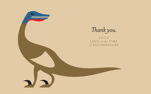
thanks dino

In the states, today is Thanksgiving. It's a time of year when the paleo corner of social media lights up with references to the dinosaurian lineage of Meleagris gallopavo. My contribution is this minimalist illustration of a vaguely deinonychosaurian theropod, inspired by a female Wild Turkey. I want to take a moment to thank the readers of Love in the Time of Chasmosaurs, the commenters, the sharers of links, and those of you who have kindly shared scans of old dinosaur books with us.

I would also like to personally thank Marc Vincent, Asher Elbein, and Niroot Puttapipat for their writings here; when I began school again I desperately wanted to keep LITC going, and because of the terrific writing of my co-bloggers, it is doing better than ever - perhaps not as frequently updated as before, but I am proud of the writing we share here, and I look forward to the day when I can pitch in at my pre-MFA studies level.

At any rate. Thank you.

Wednesday, November 21, 2012

Conway Tells All

Palaeontological illustration is not a career. It’s not a profession, and almost certainly isn’t even a living. Artists are quite cagey about how much, or little, they make at this game, so making definitive statements is difficult. But at a guess, I would say that the number of people making a living doing paleontological illustration alone is in the low single digits. Maybe as low as three, two, or none. A lot of the big names don’t make a living, or do something else to supplement their artwork, like model-making or illustrating other subjects.
- From Palaeontological Illustration, a Tell-All Confession by John Conway.

Reading this reminded me once again of the minor paleoart controversy stoked in spring of 2011, specifically Greg Paul's missive to the Dinosaur Mailing List, chastising Mark Witton, among others, for taking a similarly bleak view on the prospects of paleontological illustration as a career path in its own right. As I've worked to establish myself as a freelancer myself (though in graphic design, not illustration) and kept an eye on the stunning work routinely produced by both professional and amateur paleoartists on the web, I've thought about that DML thread. I'd love to see all of these artists thrive doing paleoart, of course, but the point Conway makes here and others have made elsewhere, is well-taken: just like so many other creatives, paleoartists need to be flexible and diverse in their pursuits. The model Conway endorses in his new piece echoes what other artists, writers, and musicians are adopting: a direct relationship between creator and audience, free of middle-men.

Read the rest of Conway's post linked above, and pick up a copy of Dinosaur Art, which features quite a nice sampling of his work.

Tuesday, November 20, 2012

Vintage Dinosaur Art: Dinosaurs - a Picture Puffin Fact Book

Once again from the childhood library of LITC reader Jon Davies, Dinosaurs (a Picture Puffin Fact Book!) is aimed at small children and was quite obviously illustrated by an artist who was jobbing. Therefore, the text is rather perfunctory (of course) and many of the illustrations consist of pretty shameless Sibbick rip-offs, as was de rigueur back in the late '80s and early '90s, back before crappy CG came along and smeared its excreta-brown, low resolution skin textures over everything. It's a bit predictable, but it has its charms.

The cover definitely owes more than a little something to Sibbick's strange 1985 T. rex (although not as much as another piece I'll be getting to shortly), from the quirky look of its head, to the perspective, to the masses and masses of concentric wrinkles. For some reason, Colin Newman (for it was he) has opted to give his tyrant a hugely fat right leg. Maybe it's a swelling...or water retention. Whatever the case, it makes me long all the more for Niroot to finish that 'T. rex as Henry VIII' he's been promising. Pfff, anyone would think he had more important stuff to be doing...

The illustrations in this book are a slightly uneasy mix of the really quite cartoony, and at least semi-serious attempts at actually restoring the animal in question and making it appear lifelike. This warty Megalosaurus is definitely in the former camp, and I love it all the more for that. Look, it's giving you the eye. You devilish rake, Megalosaurus, you. In fairness, it's also praiseworthy in that it avoids copying Neave Parker yet again (no hunchbacks here!), and duly gives the animal three, reasonably robust fingers rather than four or five tiny little piggies.

Turning the dial back to 'serious' now, and it's another piece clearly inspired by Sibbick. However, Newman has seen fit to truly turn Heterodontosaurus over to the dark side, with the addition of extra fangs and vicious-looking hand claws. It looks ready to be installed in a ramshackle 'HAUNTED MESOZOIC' funfair ghost train, stuck on the end of a lever mechanism so that it can be shoved in the faces of unsuspecting suckers.

There's often one illustration in these books that's remarkably good given the context, and here it's this Archaeopteryx. It might not be perfect, but it avoids the tedious trope of sticking extra tiny fingers on the wings because, you know, 'Archaeopteryx had clawed hands on its wings'. It also looks lovely, with carefully painted feathers and a stunning, vibrant colour scheme. It's worth pointing out that there is an equally gorgeous perched individual to the left of this one, with the text noting that "When it was on the ground, Archaeopteryx tucked its wings into its sides and ran on two legs just like our birds do today". It makes a pleasant change from the prevalent image of this dinosaur up until that point, which tended to be with its arms flapping crazily, or extended out as it lunged for its prey. These portraits are...dignified. Look, it even has a closed mouth!

Unfortunately, the book can't keep up such a high standard for very long, and just has to go and bring in the boring bloody brontosaurs, toting their mismatched heads for all they're worth. Why this chimeric monstrosity was still being inserted into books as late as 1987, I have no idea; that the animal was properly classified as Apatosaurus excelsus and had a diplodocid head was common knowledge long before then. I guess we can blame cultural inertia and people's nostalgic fondness for that name (look out for my new essay, Bollocks to Brontosaurus, appearing on here in the near future. Maybe. Probably not). People also cling to things that they remember enjoying as a child, hence the inexplicable popularity of Cadbury's chocolate in my home country in spite of its slightly peculiar taste, and the occasional angry comments on this blog when I criticise an artist for drawing an anachronistic 'brontosaur' in the '80s.

Ah, there we go - the aforementioned, very straightforward rip-off of Sibbick's meat-slinging slightly strange upright T. rex. It's even propping itself up on the huge, meaty carcass it's just bumped into. Unfortunately, such a stance made the beast rather prone to...

...tyrannosaur tipping! Here, we see the unfortunate result of T. rex having been toppled by a cheeky nudge from Triceratops, who is seen snorting with laughter in the foreground. (Well, it's certainly not sunning itself...not in that weather.) Or maybe it's a depiction of the extinction of the dinosaurs, I dunno.

And finally...a palaeontologist at work. Those shiny, toned legs and cut-off jeans are scandalously sexy, you know. Not so sure about the beard or slightly shrunken head, but I'm sure we can work something out. Anyone want to place any bets as to who this might have been based on...?

Friday, November 16, 2012

Vintage Dinosaur Art: Prehistoric World

Apparently part of a series of 'Junior Illustrated Encyclopedias', Prehistoric World dates from 1987 and features the work of a variety of artists, with text by palaeontologist Michael Benton. (It's also another one of the books that Jon Davies has let me borrow - thanks again Jon!) Unfortunately, it's not always possible to identify which artist was behind which piece - it's a shame to not be able to positively ID the artist behind the striking cover art, for example (although the style looks familiar). However, the book does feature some very interesting pieces by one artist in particular: Bernard Robinson.

Among dinosaur enthusiasts, Robinson is perhaps best known for illustrating the hugely popular Ladybird dinosaur book (simply entitled Dinosaurs). As I'm sure I've said a good dozen times by now, Robinson's particular skill was in creating stunningly realistic scaly skin textures. The animals' hides are rendered down to the tiniest detail, with each scale glistening perfectly in the scorching sunlight. By the late 1980s, however, Robinson's dinosaurs were taking on a strikingly anachronistic appearance, even if they remained beautifully painted.

Robinson's Ladybird dinosaurs were definitely of the old swamp-dwelling lizardy school, and it's tempting to assume that the illustrations in Prehistoric World came later for a couple of reasons - firstly, some of the restorations appear notably more modern and secondly, the apparent inspirations behind some of the pieces seem to have changed. The weedy limbs and colour scheme on the above illustration are certainly consistent with Robinson's earlier work, but the strangely-shaped head and weird, leathery skin texture appear to owe a lot to 1980s Sibbick. (I feel obliged to mention the 1980s Spinosaurus too! Actually, it's a pretty good one. I should start a compendium of these.)

Out of all the Robinson illustrations in this book, the above is perhaps most noteworthy for deviating from what one might expect from the artist. The Tyrannosaurus and Triceratops look familiar enough (especially the latter), and Robinson frequently depicted small(/ish) theropods as being notably more active than most of his other dinosaurs. However, the ankylosaur (labelled "Ankylosaurus", but obviously Euoplocephalus), with its active posture and elevated tail, marks a remarkable departure from Robinson's earlier depictions of such animals, and even of large herbivorous dinosaurs in general. It too would seem to owe a lot to Sibbick.

Why hello there, Mr Crocodile. Aren't you quite the handsome crocodile? Why, yes you are. It's very nice and all, but I've only really included this one for two reasons:
  1. Don't those birds look a lot like mallards?
  2. Michael Benton's caption makes me laugh. "The last days of the dinosaurs. Most of the animals shown here - the giant crocodile, frogs, birds, mammals [cropped out], plants and insects - survived the mass extinction. The dinosaurs alone in this scene were doomed." They were doomed, I tells ya! Doooomed!

Back to the task at hand. The Iguanodon here are more classically Robinson, particularly in terms of skin texture; even so, although they are upright they lack the stiff, man-in-suit appearance of the Ladybird incarnation. The Hypsilophodon also show marked changes over earlier renditions, with alert postures, elevated tails and an overall Neave Parker-free look, while the freewheeling birds and adorable tortoise (mostly cropped out by the scanner, I'm afraid) add a pleasing believability to the scene. The sauropods, though, are bloody awful. Well, what can I say - I'm just caustic (for popularity's sake).

Robinson aside, the illustrations by other artists in this book tend to show the usual Burian and Zallinger influences (as above), which is a little yawnsome, and perpetuates a lot of the mistakes that Burian made through lack of available reference material. I am rather fond of the vibrant colours and painterly quality in the above piece, though, and the malevolent look on the face of the Allosaurus as it prepares to spring out on its victim is just marvellous.

This Triassic scene is notable for including the theropod Procompsognathus, which remains rather poorly understood. The restoration here is certainly rather odd, with its short neck, apparently near-vestigial arms and hands, and upright, tottering walk. Because it's known from such fragmentary remains, Procompsognathus doesn't often feature in art, although it did feature in Michael Crichton's Lost World novel, in which it had a poisonous bite and ate dung or something. (I'll anticipate a comment here and point out that, yes, in the movie the Robert Bakk...Burke character did mistakenly refer to "Compsognathus triassicus", conflating C. longipes and P. triassicus.) The Plateosaurus in the background are modelling for early '90s mid-market dinosaur toy sculpts, and don't look too happy about it. Maybe they're not being paid enough.

And finally...déjà vu. Didn't we see these guys a couple of weeks back? Yes indeed, it's yet more short-tailed, mast-necked Barosaurus, with the obligatory inclusion of an individual craning its neck down towards the viewer. It's a meme that lasted at least a decade, although it's not one that I remember from my childhood - by then, it was all about the grumpy grey Dorling Kindersley model Barosaurus, and of course art based on that skeletal mount. Note that the wild weight guesses here refer to "Ultrasauros", another happy reminder that you're reading a dinosaur book from the 1980s.

I'll be back soon! Sorry about the delay this week - Real Life got in the way, although quite pleasantly for a change. There won't be such a delay before the next one, promise, and I've got more of Jon Davies' books to get through!

Thursday, November 8, 2012

Archosaurs and Automata: An Artistic Exposition


A mechanical Euparkeria graces this Archosaurs and Automata advert by Scott Elyard.

With only four days to go in their Indiegogo funding campaign, artists Raven Amos and Scott Elyard could use a boost from fans of paleoart. The funding drive will help Scott and Raven with expenses incurred in mounting and travelling to their upcoming art show, Archosaurs and Automata. You may remember their previous art show, Dinosaurs and Robots, which garnered some great coverage online, including this piece from Boing Boing. If a bunch of people each donate a little cash, this could easily be funded, and it shall be a rousing victory for the great paleoart revolution. Check out Scott's video below, then head over to Indiegogo to help out!


The cool thing is that no matter how little you contribute, you get a perk. Even at the five dollar level, you get a set of postcards bearing artwork from the show, great for sending to dinosaur fans in your life, or even hanging around your cubicle to impress your coworkers. Of course, if you've got the means to contribute a bit more, the prizes get even cooler, including shirts, prints, and even original art.

More from Scott:
Coherent Lighthouse
Cyrillic Typewriter
Flickr
His Redbubble Shop


More from Raven:
The Caw Box
DeviantArt
Her CafePress shop
Her Redbubble shop

Monday, November 5, 2012

Vintage Dinosaur Art: The Complete Book of Dinosaurs - Part 2

In addition to hosting a range of often rather bizarre-looking, pop-eyed dinosaurs, The Complete Book of Dinosaurs also sees fit to heavily feature bizarre-looking, pop-eyed pterosaurs (as if pterosaurs didn't look weird enough anyway). Pterodactylus receives by far the most attention, and that'll be because it was the star of one of the Beverly Halstead books that were haphazardly cobbled together to make The Complete Book.


Plaudits should be offered for making the pterosaurs hairy, but other than that they look quite alarmingly strange. Repeated mentions are made of the animals' "leathery wings", and it seems to be a description that Jenny Halstead's really taken to heart - they look like the sort of animals that, if alive today, would be farmed to create wallets, handbags and general accoutrements for Harley Davidson enthusiasts. You'd probably get quite a lot of breast meat too, but the matchstick arms would have to be disposed of (by snapping them off, presumably).

I'm particularly fond of the pterosaur chicks, who wail hauntingly in unison while wearing their own adorable, tiny Dracula capes and staring piercingly from their cold, black, lifeless eyes. Of course, no Late Jurassic flying creature is ever safe from being grabbed in mid-air by a small carnivorous dinosaur, and so it transpires here.

I love the mottled pattern on these Compsognathus (erroneously depicted with two-fingers here, as they frequently were well into the 1990s), although the one in the background is just a plaster and a hairy pimple away from turning into a Korky Paul cartoon, while the unlucky pterosaur appears to have wings made out of tissue paper (what happened to that tough ol' leather?). Meanwhile, Bev Halstead solemnly intones that "Compsognathus has been found with the remains of the longtailed pterosaur Bavarisaurus preserved in its stomach". There's only one problem with that - Bavarisaurus was a lizard.

Still, if nothing else this part of the book (as with the Deinonychus section) does depict some pterosaur behaviour besides 'flying over the sea, going fishing' and 'hanging impossibly from a tree', which is quite unusual for a popular prehistory book of the time. The speculative symbiotic behaviour in the above image has been portrayed a number of times elsewhere, but is quite a nice touch nonetheless. Also, the smug look on the face of the theropod (allegedly Megalosaurus, which tended to just mean 'a generic big theropod' at the time) is absolutely priceless, as is the palms-up posture of the pterosaur perched in its maw. Maybe the little guy will try and hold the palate up when its host decides it's had enough.

Rhamphorhynchus now, and this one's perhaps most alarming because it's borrowed the de facto palaeoart uniform of the Late Cretaceous bird Ichthyornis, and therefore appears to have a head that doesn't belong to its body; this certainly isn't helped by its head also being the wrong shape and size. In the book it is, rather unfortunately, also described as a "large flying dinosaur" - just to compound the wrongness further. Why, if it's flying dinosaurs you want...

...you've got one right here! (Yes, I'm aware that the true flying ability of Archaeopteryx is up for dispute...bloody pedants.) "On each of the wings was a little, clawed reptilian hand," coos B. Halstead, rather misleadingly. The illustration subsequently follows the boringly frequent 'cute mini-hands' trope seemingly developed by people who didn't spend anywhere near long enough examining their roast dinners, but at least is quite pretty, if you pay no heed to the ugly bat-pterosaurs that are intruding upon the scene.

And finally...Quetzalcoatlus, once again with arms like toothpicks, but at least it boasts the characteristic azhdarchid long neck and legs and large, toothless head (by no means a given in the early 1980s). "They certainly could not have taken off from the ground under their own power," scoffs Halstead. So that's you told, then.

Coming next time: a book from Woolworths! Ah, thank you Jon D, I owe you one.

Saturday, November 3, 2012

Amargasaurus, a poem

So... I found a bunch of very old stuff I wrote in a journal. Stuff I'd completely forgotten about, that gives me this strange look at a me I don't totally remember being. It's messing with my head.

However.

During this excavation, I discovered a poem I wrote about Amargasaurus. No claim to quality, mind you. Just a novelty.

Amargasaurus, spiney-fair
My darling sauropod
May a peace descend upon
Your stormy bowels
Clippings of leaf and twig
Nipped by peg-like teeth
Now brewing hot
Now bubbling joyous
An Argentinian most Cretaceous
An elegant Diplodocid
Modest in proportion
Splendid in adornment


Weird. I clearly come from the Lt. Cmdr. Data school of poetical composition.